What Is a Column Chart in Excel? (2026 Guide)
 Carlos Garcia6/8/2026
When you need to compare numbers across categories at a glance, the column chart is one of the first Excel visualizations most people reach for. It is intuitive, it scales well from three categories to thirty, and it is built into every version of Excel since the early 1990s. Yet plenty of marketers and analysts still default to a pie chart or a line graph when a column chart would have told the story faster and more clearly. Knowing exactly what a column chart is, when it works, and when it does not is one of the highest-return skills you can pick up in Excel.
What Is a Column Chart in Excel?
A column chart in Excel is a graph that displays data as vertical rectangles, where the height of each rectangle is proportional to the value it represents. Categories run along the horizontal x-axis, values run up the vertical y-axis, and each column gives you an immediate visual comparison between data points.
The basic column chart is the foundation, but Excel also gives you several variants. Clustered column charts place multiple columns side by side to compare more than one series across the same categories. Stacked column charts stack the series on top of each other to show both the total and the contribution of each part. 100% stacked column charts normalize the totals to 100% so you can compare relative shares.
Column charts share a family resemblance with bar charts, which use horizontal bars instead. The technical difference is just orientation, but the use cases diverge. Column charts work best for time series and short category labels. Bar charts work better when you have long labels or more than ten categories.
If you are building marketing dashboards in Excel and want them to convert to live reports your stakeholders actually open, get a free SEO Stuff audit and we will review your data pipeline.
Why Use a Column Chart in Excel
The column chart earned its place as Excel's default chart type for a reason. Three things make it hard to beat for everyday comparisons.
Instant Visual Comparison
Humans are wired to compare heights. When two columns sit next to each other, the eye picks up the difference in milliseconds without any conscious calculation. That is a property few other chart types share.
Works With Almost Any Data
A column chart needs a list of categories and at least one numeric series. That is the same data shape you already have in most spreadsheets, which means you can usually create a column chart with two clicks rather than rebuilding your data layout.
Scales From a Single Series to Many
Whether you have one number per category or five, a column chart can show it. Clustered columns let you compare multiple metrics. Stacked columns let you show composition. Combined column-and-line charts let you mix a magnitude metric with a percentage on a secondary axis.
How to Make a Column Chart in Excel
Building a column chart in modern Excel takes about ten seconds once your data is organized.
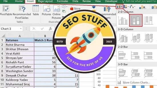
- Highlight the range that contains your categories and values. Include the header row so Excel can label your axes correctly.
- Go to the Insert tab on the ribbon and find the Charts group.
- Click the Insert Column or Bar Chart icon. The dropdown shows clustered, stacked, and 100% stacked options in both 2D and 3D versions.
- Choose Clustered Column for most cases. The chart appears on your worksheet immediately.
- Drag the chart to the location you want and resize it by dragging the corners.
- Use the Chart Design tab to add titles, change colors, or switch styles.
- Right-click any element of the chart, such as the axis or a column, to fine-tune the formatting.
If you skip step one and just hit Insert with no selection, Excel will create an empty chart and ask you to add a data series manually. That works but takes longer than highlighting first.
Need help turning your raw Excel data into reports your team will actually use to make decisions? SEO Stuff's free audit covers reporting workflows alongside SEO health.
Column Chart Subtypes in Excel
Excel ships with several column chart subtypes, and choosing the right one is most of the work.
Clustered Column Chart
Clustered columns place each series in its own column, grouped by category. Use this when you want to compare the same metric across multiple subjects, like Q1 revenue for three different products.
Stacked Column Chart
Stacked columns sum each series within a single column, showing both the total and the parts. Use this when totals matter and you want to see composition at the same time, like total sales broken down by region.
100% Stacked Column Chart
100% stacked columns force every column to the same height by normalizing to percentages. Use this when proportions matter more than absolute values, like share of voice across competitors over time.
3D Column Chart
3D variants exist for all three subtypes. They look more visually interesting but almost always make the chart harder to read because the perspective distorts the height comparison. Avoid them in analytical reports unless you have a specific design reason.
When to Use a Column Chart
A column chart is the right choice when your data has discrete categories, when the number of categories is small to moderate (roughly three to twelve), and when the goal is to compare values directly. It is also the natural pick for time series with a small number of intervals, like monthly revenue for the past year or weekly active users for the past two months.
If your time series has more than thirty intervals, switch to a line chart so the eye can follow the trend without being interrupted by tall columns. If your category labels are longer than the columns themselves, switch to a bar chart so the labels can sit horizontally next to each bar.
Limitations of a Column Chart
Three weaknesses worth knowing. First, column charts struggle when category labels are long. Excel rotates labels to fit, which makes them harder to read. Second, the eye gets fatigued when there are too many columns on screen at once, typically beyond twelve to fifteen. Third, when you have widely varying values on the same axis, the smaller columns become hard to compare visually. A logarithmic scale can help but most readers find log axes confusing.
If you are stitching together Excel reports from multiple data sources and want a sanity check on the underlying data, request a free SEO Stuff audit and we will trace the numbers back to the source.
Column Chart vs Alternatives in Excel
A few other Excel chart types overlap with the column chart's job, and knowing where they win is half the battle.
Column Chart vs Bar Chart
The bar chart is a column chart rotated 90 degrees. It wins when you have long category labels, more than fifteen items, or when you are ranking from highest to lowest and want the top rank to appear at the top of the screen.
Column Chart vs Line Chart
A line chart shows continuity over time. Use it when the data points have a natural order and the story is about the shape of the trend rather than the value at each point. For monthly data with twelve or fewer months, either works. For daily data over a year, the line chart wins.
Column Chart vs Pie Chart
Pie charts show parts of a whole. They are appropriate for two or three categories where the percentages are distinct, and almost nothing else. A column chart will out-communicate a pie chart in nearly every situation that involves more than three slices.
Column Chart vs Stacked Bar Chart
Use a stacked column when you want to compare totals as well as composition. Use a stacked bar when your category labels are long or when ranking by total is more important than time progression.
Column Chart vs Waterfall Chart
A waterfall chart breaks down a cumulative total into positive and negative contributions. Use it when you need to show how a starting value became an ending value, like profit going from gross revenue to net income through deductions.
Final Thoughts
The column chart is the workhorse of Excel data visualization for the same reason the hammer is the workhorse of the toolbox. It is simple, it is universal, and the times you actually need something else are fewer than people think. Master the four subtypes, learn when to switch to a bar or line chart instead, and you will produce clearer reports than analysts using fancier tools. If you also want to brush up on related Excel chart types, our guide to the bubble chart in Excel walks through a more advanced case where three variables need to share the same plot.
Want your marketing dashboards to actually move the needle? Get a free SEO Stuff audit and we will help you connect your Excel reports to live data sources and SEO performance.