
What Is a Bubble Chart in Excel? (2026 Guide)
 Carlos Garcia5/20/2026
If you've been working in Excel and seen the bubble chart option in the chart picker, you've probably wondered what it actually shows, when it beats a regular scatter or bar chart, and how to build one. A bubble chart in Excel is a variant of the scatter plot that displays three numeric variables at once — two on the X and Y axes, and the third encoded as the size of each bubble. It's the right chart when you want to show relationships across three dimensions in a single visual without resorting to 3D or stacked formats. This guide explains what a bubble chart is, when to use it, exactly how to build one, common mistakes, and when to reach for a different chart instead.
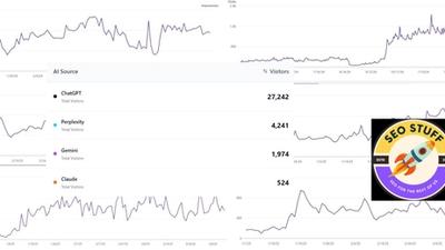
Free SEO + AI Search Audit. Bubble charts visualize three dimensions at once. A free SEO + AI search audit visualizes your site's visibility across Google AND every major AI search engine — ChatGPT, Claude, Perplexity, and Gemini. Run your free audit → to see where your site stands in 60 seconds.
What Is a Bubble Chart in Excel?
In simple terms, a bubble chart in Excel is a variation of the scatter chart that uses three values per data point: an X position, a Y position, and a bubble size. Each bubble represents one observation (one product, one customer, one campaign — whatever your data row represents), and the visual relationship between bubbles tells you something the underlying numbers don't immediately show.
Excel's bubble chart is found under Insert → Charts → Scatter (X, Y) or Bubble Chart. It supports both 2D bubbles and 3D-effect bubbles (the 3D variant adds visual depth but no extra information).
The chart works because human eyes can compare positions on two axes and sizes of circles simultaneously. It's especially good for showing:
- Three-variable relationships (e.g., price vs sales vs profit margin per product)
- Portfolio analyses (e.g., market growth vs market share vs revenue)
- Performance maps (e.g., effort vs impact vs cost)
- Risk/return/exposure visualizations
When to Use a Bubble Chart
Bubble charts are powerful but easy to misuse. Here's when they're the right call.
1. You Have Three Numeric Variables Per Observation
If your data has three meaningful numeric dimensions per row, a bubble chart can show all three in one view. With only two dimensions, use a scatter plot. With four or more, consider faceting or a different chart entirely.
2. The Third Variable Is Naturally a "Magnitude"
Bubble size works best when the third variable represents quantity, weight, frequency, or revenue — something where "bigger = more." Variables that are categorical or signed (positive/negative) don't translate well to size encoding.
3. You Want to Reveal Clusters or Outliers
Bubble charts excel at showing clusters of similar observations and outliers that stand alone. If you're trying to identify which products are big-and-cheap vs small-and-expensive, a bubble chart makes the pattern visible.
4. You're Building an Executive Visual
Bubble charts compress a lot of information into one chart, which is useful for senior audiences who want signal-not-noise. Especially common in BCG-style growth-share matrices or McKinsey portfolio plots.
5. You Need to Avoid 3D Charts
3D bar charts and 3D pies are widely (rightly) disliked. A bubble chart is the right 2D way to show "three things at once" without resorting to 3D.
How to Make a Bubble Chart in Excel Step by Step
Building one is straightforward once you organize the data correctly.
Step 1: Structure Your Data
Lay out three columns:
- Column A: the X-axis values (e.g., Sales)
- Column B: the Y-axis values (e.g., Profit margin %)
- Column C: the bubble size values (e.g., Units sold)
Optionally add a fourth column with labels (e.g., Product name) for tooltip or annotation use.
Step 2: Select the Data
Highlight the three numeric columns (A, B, C). Don't include the label column in the initial selection — you'll add labels in a later step.
Step 3: Insert the Bubble Chart
Go to Insert → Charts → Insert Scatter (X, Y) or Bubble Chart → Bubble (or 3D Bubble).
Excel will generate a default chart. The default usually needs cleanup.
Step 4: Add Data Labels
Click any bubble → right-click → Add Data Labels. By default Excel adds the Y value. Click the labels, then right-click → Format Data Labels. Under "Label Options," check Value From Cells and select your label column (the Product name column).
This gives you a label next to each bubble identifying what it represents.
Step 5: Format the Axes
Right-click each axis → Format Axis. Set minimum and maximum bounds explicitly (Excel's defaults often hide structure). Add axis titles (right-click chart → Add Chart Element → Axis Titles) that name what X and Y represent.
Step 6: Adjust Bubble Size
Right-click any bubble → Format Data Series → Series Options. The Scale bubble size to field defaults to 100%. If your bubbles are too large or too small, reduce or increase this. Also choose whether bubble size represents area (default, statistically correct) or width (less accurate but more visually dramatic).
Step 7: Clean Up the Chart
Remove the legend if it's redundant. Add a meaningful chart title. Consider adding gridlines only on one axis if both are cluttered. Use color sparingly — solid colors work better than gradient fills.
Common Mistakes in Bubble Charts
A few patterns to avoid.
1. Using Width Instead of Area for Sizing
When Excel sizes bubbles by width, a bubble representing "twice the value" looks four times as big visually (because area scales as the square of width). This visually exaggerates the third variable. Always use area-based scaling unless you have a specific reason not to.
2. Overlapping Bubbles
If your bubbles overlap so much that you can't see individual data points, you have too much data for one bubble chart. Consider filtering, faceting (small multiples), or switching to a heatmap.
3. Too Many Categories
Bubble charts work best with 5-30 bubbles. Above 30, the visual gets noisy and the cognitive load exceeds what the format can carry.
4. Using Negative Numbers in the Size Variable
Bubble size can't be negative. If your third variable includes negatives, either choose a different variable for size or encode the sign with color (negative=red, positive=green) and use absolute value for size.
5. Misleading Axis Scales
Bubble charts are especially sensitive to axis manipulation. Setting an axis to start at a non-zero value can make tiny differences look dramatic. Be transparent about axis scaling.
Free SEO + AI Search Audit. Just like a bubble chart shows three variables at once, a proper SEO + AI search audit shows your visibility across multiple search engines — Google, ChatGPT, Claude, Perplexity, and Gemini — all in one view. Get a free audit.
Bubble Chart vs Other Excel Chart Types
When to pick a bubble chart vs an alternative.
Bubble Chart vs Scatter Plot
A scatter plot shows two variables; a bubble chart shows three. If your third variable is just a categorical grouping, use a scatter plot with colored markers instead — easier to read.
Bubble Chart vs Column Chart
Column charts show one variable across categories. If you only have two variables (category + value), use columns. Use a bubble chart only when you have three numeric variables per data point.
Bubble Chart vs Heatmap
Heatmaps work better when you have many observations (50+) or when your data is naturally a grid (rows × columns of values). Bubble charts work better when each observation has a distinct identity worth labeling.
Bubble Chart vs Treemap
Treemaps show hierarchical part-to-whole relationships with rectangles. They're better for showing how a total breaks down across categories. Bubble charts show position-based relationships, which treemaps can't do.
Bubble Chart vs Bullet Chart
Bullet charts show performance against a target. If you're comparing actuals to goals on a single dimension, a bullet chart is clearer. Bubble charts don't directly show targets.
Real-World Examples Where Bubble Charts Shine
Cases where bubble charts genuinely add value.
1. Product Portfolio Analysis
X = unit price, Y = profit margin, bubble size = units sold. One chart shows you which products are high-volume-low-margin, which are low-volume-high-margin, and which are the ideal high-margin-high-volume winners.
2. Marketing Campaign Performance
X = cost per click, Y = conversion rate, bubble size = total spend. Reveals which campaigns are efficient, which are big-and-mediocre, and which are small experiments worth scaling.
3. Customer Segmentation
X = recency of purchase (days), Y = order frequency, bubble size = lifetime value. The classic RFM-style visual in one chart.
4. Country-Level Sales Analysis
X = GDP per capita, Y = market penetration %, bubble size = your country revenue. Shows which markets are over- and under-performing relative to economic potential.
5. Engineering Effort Mapping
X = engineering effort estimate, Y = business impact estimate, bubble size = number of teams blocked on it. Helps prioritize what to actually build.
Limitations of Bubble Charts in Excel
A few real constraints.
Hard to read with too many bubbles. Above ~30 data points, you lose the ability to distinguish individual bubbles. Filter or facet.
No built-in labels on hover. Excel's bubble chart doesn't natively show hover tooltips with all three values — you have to add labels manually or use the Value From Cells trick.
Bubble size perception is approximate. Even with area-based scaling, humans aren't great at judging absolute size differences in circles. Pair the chart with a data table for exact values.
Limited color encoding. Excel's bubble chart treats all bubbles as one series by default; using color to encode a fourth variable requires creating multiple series, one per color group.
3D bubble charts add no information. The 3D variant looks fancy but doesn't convey anything the 2D version doesn't. Stick with 2D for clarity.
Final Thoughts
A bubble chart in Excel is a 2D scatter plot with a third dimension encoded as bubble size. It's the right pick when you have exactly three meaningful numeric variables per observation and you want all three visible in one chart — common in portfolio analysis, marketing performance reviews, and customer segmentation. With more or fewer variables, reach for a different chart. With more than ~30 bubbles, switch to a heatmap or small multiples. Used well, bubble charts make patterns and outliers immediately obvious to a busy audience.
Beyond Excel visualization, the bigger 2026 question for most marketing teams is whether your data is telling you about the right channels. Increasingly, buyers find products through AI search engines like ChatGPT, Claude, Perplexity, and Gemini — channels that don't show up in standard analytics views. While you're optimizing the charts in your Excel reports, you may be invisible in the AI answers shaping more and more buying decisions. Run a free audit to see exactly where your site performs across Google AND every major AI search platform — and which fixes will move your traffic the fastest this quarter.