
What Is a Pivot Table in Excel? A Complete 2026 Guide
 Carlos Garcia5/16/2026
If you've got a spreadsheet with hundreds (or thousands) of rows of data and you need to summarize it — totals by category, averages by month, counts by region — a pivot table in Excel is the single most powerful built-in tool for the job. Pivot tables let you reshape, group, and summarize data interactively, without writing a single formula. This article walks through exactly what a pivot table is, how to make one in Excel in 2026, the most useful features to know, and the practical scenarios where pivot tables save hours of manual work.
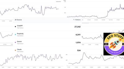
Free SEO + AI Search Audit. Pivot tables turn data into clear answers. But what about your website data — how it performs in Google AND in AI platforms like ChatGPT, Claude, Perplexity, and Gemini? Run your free audit → to see exactly where your site stands across every major search and AI platform in 60 seconds.
What Is a Pivot Table in Excel?
In simple terms, a pivot table in Excel is a tool that takes a long table of detailed data and summarizes it into a much smaller table that answers a specific question — like "total sales by region" or "average rating per product" or "number of orders per month." You don't write formulas. You drag fields into the pivot table editor, and Excel computes the summary automatically.
Think of a pivot table as a smart filter combined with a calculator. You point it at raw data, tell it which fields to group by (rows and columns), what to compute (sum, count, average, etc.), and it produces a clean summary table. Change your mind about how you want to slice the data, drag fields around, and the summary instantly updates.
Pivot tables are among the most powerful features in Excel — and they're among the least-used by casual Excel users, who tend to default to manual filtering and `SUMIF` formulas for tasks that pivot tables would solve in seconds.
Why Pivot Tables Are So Powerful
A few specific reasons pivot tables beat manual analysis:
- Instant reshaping. Drag fields between rows, columns, and values to look at the same data from completely different angles, in seconds.
- Automatic aggregation. Sum, count, average, min, max — Excel computes whatever you need on whatever grouping you specify.
- Handles large datasets. Pivot tables work efficiently on tens of thousands of rows. Manual filtering crawls; pivots stay fast.
- No formulas to break. Unlike a sheet full of `SUMIFS`, a pivot table is a single object that updates automatically when source data changes. Less to break, less to debug.
- Drill-down to source data. Double-click any cell in a pivot table summary and Excel shows you the underlying rows that contributed to that cell. Great for verification.
How to Make a Pivot Table in Excel (Step-by-Step)
Building your first pivot table takes about a minute.
- Select your data. Click any cell inside your data range, or highlight the full range manually. Excel is usually smart enough to detect the boundaries automatically.
- Go to the Insert tab and click PivotTable.
- In the Create PivotTable dialog, confirm the Table/Range is correct. Choose whether to put the pivot table in a New Worksheet (recommended) or an Existing Worksheet location. Click OK.
- The PivotTable Fields pane opens on the right side of the screen. Your pivot table is empty at first — just an empty grid waiting for you to add fields.
- Add fields to the four sections in the PivotTable Fields pane:
- Rows — fields that become rows in your summary (typically your main grouping field, like "Region" or "Product") - Columns — fields that become columns (often a secondary grouping, like "Year" or "Channel") - Values — what gets computed (typically a numeric field, like "Sales" or "Quantity") - Filters — fields that limit which rows from the source data get included
- For each Value, choose the aggregation function (Sum, Count, Average, Min, Max, etc.) by right-clicking the value field → Value Field Settings.
- The pivot table updates in real time as you drag fields in.
That's it. Your pivot table is live. To change it, just drag fields in/out of the PivotTable Fields pane — no rebuilding required.
Useful Pivot Table Features You Should Know
Once you've built a few basic pivot tables, these features unlock the next level.
Sort and Filter Within the Pivot
Click the dropdown arrow on any Row or Column header in the pivot table to sort or filter values. You can sort by labels (alphabetical) or by values (largest first). For filters, you can hide specific categories or apply value-based filters (top 10 by sum, for example).
Show Values As Percentages
Right-click any Value field → Show Values As → "% of Grand Total" (or % of Row Total, % of Column Total). Excel switches from absolute numbers to percentages. Excellent for share-of-mix analysis.
Group Dates by Month, Quarter, or Year
If your source data has a date column, drag it into Rows, then right-click any date in the pivot → Group → choose Months, Quarters, Years, or any combination. Excel automatically groups your dates without you needing to add helper columns to the source data.
Add Calculated Fields
For metrics that aren't a simple SUM or AVERAGE — like profit margin (revenue minus cost, divided by revenue) — use a Calculated Field. PivotTable Analyze tab → Fields, Items & Sets → Calculated Field. Write a formula referencing your existing fields, and Excel computes it per row.
Slicers and Timelines (Visual Filters)
Slicers are interactive filter buttons that float next to your pivot table. PivotTable Analyze → Insert Slicer. Pick a field and Excel creates buttons; click a button to filter the pivot. Timelines are the same concept for date fields. Slicers turn pivot tables into mini-dashboards.
Connect Multiple Pivots to One Slicer
If you have multiple pivot tables built from the same source, you can connect them to a single slicer so filtering one filters them all. PivotTable Analyze → Filter Connections.
Free SEO + AI Search Audit. Pivot tables slice the same data by region, by month, by category. The same principle applies to your website — but most site owners only ever look at one slice (organic Google traffic) and miss the bigger picture across AI search. Run a free audit of exactly how your site performs in Google AND in ChatGPT, Claude, Perplexity, and Gemini.
Pivot Charts
Insert → PivotChart creates a visual companion to your pivot table. The chart and table stay in sync — filter the slicer and both update simultaneously.
When Should You Use a Pivot Table?
Pivot tables shine in these scenarios:
1. Monthly or Quarterly Performance Reports
Any recurring report — sales, marketing, ops, finance — should be powered by pivot tables. Connect a pivot to your raw transactions or events, and your monthly report becomes a refresh-and-export operation instead of a manual rebuild.
2. Ad-Hoc Analysis on Large Datasets
When you have thousands of rows and a question to answer ("which products had the highest growth quarter-over-quarter?"), a pivot table answers it in seconds. Manual filtering would take an hour.
3. Cross-Tabulations and Comparisons
When you need to compare metrics across two dimensions — channel performance by region, or product mix by quarter — a pivot table is the only practical option.
4. Cleaning Up Messy Data
Pivot tables surface inconsistencies fast. If "Region" should have 5 values but the pivot shows 8 (with "West " and "WEST" and "west" each appearing as separate categories), you've just spotted dirty data. Fix at the source, refresh the pivot, done.
Free SEO + AI Search Audit. Cleaning up spreadsheet data prevents bad business decisions. Cleaning up your website data — consistent metadata, clean schema markup, deduplicated content — prevents bad search rankings. Get a free audit of where your site has the equivalent of "WEST" vs "west" inconsistencies in its SEO data, and what to fix first.
5. Building Dashboards
A few pivot tables, a few pivot charts, and some connected slicers create a functional dashboard in 30 minutes. For internal team dashboards, this is often a faster path than firing up Power BI or Tableau.
Limitations of Excel Pivot Tables
Source data must be tabular. Pivot tables need a clean table with one record per row and a header row. If your data has merged cells, blank rows, or summary subtotals embedded, you have to clean it up first.
Pivot tables don't auto-refresh. When you change source data, you have to right-click the pivot → Refresh. (For automatic refresh on file open, PivotTable Analyze → Options → Data → Refresh data when opening the file.)
Calculated fields are limited. The Calculated Field editor doesn't support all Excel functions, and complex logic sometimes requires helper columns in the source data instead.
Source range needs to expand manually. If you add rows to your source data outside the original range, the pivot table doesn't include them. Either convert your source to an Excel Table (Insert → Table) so it auto-expands, or update the source range manually.
Memory limits on very large datasets. Pivot tables on millions of rows can slow Excel down. For really large data, Power Pivot (Excel's data model) handles it better than standard pivot tables.
Pivot styles are limited. Excel's built-in pivot styles can look dated. For polished output, plan to either customize the styling manually or copy the pivot output into a regular formatted range.
Sharing across versions can break. Pivot tables built in newer Excel versions sometimes don't render perfectly in older versions, and pivot tables created on Mac vs Windows occasionally have subtle differences.
Final Thoughts
Pivot tables are one of those tools that, once you understand them, you can't imagine going back to manual summing. The first time you replace a 30-minute manual spreadsheet rebuild with a 30-second pivot table refresh, you'll wonder why you didn't learn this years ago. If you're an Excel user who hasn't yet committed to pivot tables, this is the single highest-ROI skill you can pick up in the entire product.
That said, summarizing data well only matters if you're working on the right data in the first place. For most businesses in 2026, the most important "data" isn't internal — it's how your site is performing across Google and the new generation of AI search engines, where buyers increasingly find products and services. Most teams have no visibility into their performance on ChatGPT, Claude, Perplexity, and Gemini — the four platforms quietly driving more referral traffic every month. Run a free audit to see exactly where your site stands across Google AND every major AI search platform — and which fixes will move your traffic the fastest this quarter.