How to Make a Project Plan Gantt Chart in Excel (2026 Guide)
 Carlos Garcia5/16/2026
If you've got a project with multiple tasks, dependencies, and deadlines — and you want a visual timeline you can share with stakeholders without paying for Microsoft Project, Smartsheet, or Asana — building a Gantt chart in Excel is the fastest, cheapest, most universally-compatible solution. This article walks through exactly how to make a Gantt chart in Excel in 2026, the techniques that actually work, customizations that make it presentation-ready, and the practical scenarios where Excel is the right tool versus when you should reach for something else.
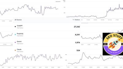
Free SEO + AI Search Audit. Project plans help you ship work. But are the products and services you're shipping actually findable when your customers search? Run your free audit → to see exactly where your site stands across Google AND every AI search platform (ChatGPT, Claude, Perplexity, Gemini) in 60 seconds.
What Is a Gantt Chart?
In simple terms, a Gantt chart is a horizontal bar chart that visualizes a project schedule. Each task gets its own row, and each task is represented by a horizontal bar whose position shows when the task starts, whose length shows how long it lasts, and whose end point shows when it finishes. Looking at a Gantt chart, you can see at a glance which tasks are running in parallel, which are sequential, what the critical path looks like, and where the project stands today against the plan.
Gantt charts were invented by Henry Gantt around 1910 and have been the default project-schedule visualization for over a century. Modern tools (Microsoft Project, Asana, Monday, ClickUp, Smartsheet) all use Gantt-style views, but Excel remains the most common place real-world project managers build them — because everyone already has Excel, and a Gantt chart in Excel is shareable as a file or a screenshot without any subscription required.
Why Build a Gantt Chart in Excel?
A few reasons Excel beats dedicated PM tools for many project plans:
- No license cost. Everyone in your org already has Excel. No new tool purchase, no procurement cycle.
- Universal sharing. Email the .xlsx file. The recipient doesn't need an account anywhere.
- Full control over formatting. You can match brand colors, add custom columns, include cost or owner data alongside the schedule.
- Pivot-able and editable. Adjust dates, add tasks, change durations — everything updates with formulas. No clicking through PM software menus.
- Integrates with the rest of your spreadsheet workflow. Roll budget data, resource allocations, or financial summaries into the same workbook.
The tradeoff: Excel Gantt charts don't auto-track dependencies, don't have built-in critical-path analysis, and don't notify task owners. For complex, multi-team, dependency-heavy projects, a dedicated tool earns its cost. For most project plans up to ~30-50 tasks, Excel is fine.
How to Make a Gantt Chart in Excel (Step-by-Step)
There are two reliable methods. We'll cover the stacked bar chart method (most common), then the conditional formatting method (sometimes cleaner for simpler schedules).
Method 1: Stacked Bar Chart
This is the canonical Excel Gantt chart approach.
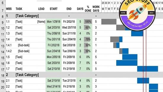
- Set up your task table. Create three columns: Task name, Start date, Duration (in days). Add a fourth column for End date if helpful, calculated as `=Start + Duration`. Each row is one task.
- Select the Task name and Start date columns. Highlight both columns including headers.
- Go to Insert → Bar Chart → Stacked Bar. Excel inserts a stacked horizontal bar chart with one bar per task, anchored at the start date.
- Right-click the chart → Select Data → Add a new series. Set the series name to "Duration" and series values to the Duration column.
- Make the start-date bars invisible. Click any blue (start-date) bar to select all of them. Right-click → Format Data Series → Fill → No fill. The chart now shows only the duration bars, floating at the right start position.
- Reverse the task order. By default, tasks appear bottom-to-top. To reverse: click any task name on the y-axis → Format Axis → check "Categories in reverse order."
- Format the date axis. Right-click the x-axis (dates) → Format Axis → set Minimum and Maximum to your project start and end dates. Adjust the unit to match your project duration (weeks for short projects, months for longer ones).
- Customize colors and labels. Change the duration bar color to match your brand. Add data labels showing task names directly on bars if useful. Add a vertical line at "today" using a separate scatter series if you want to mark progress.
That's the basic Gantt. From here, you can layer in additional series for milestones, dependencies (using arrow shapes), or actual-vs-planned progress.
Method 2: Conditional Formatting
For very simple schedules, conditional formatting on a calendar grid is sometimes cleaner.
- Create a calendar grid across columns (one column per day or week).
- List tasks down the left with Start and End dates as columns.
- Apply conditional formatting to fill cells with a color when the cell's date falls between the task's start and end. Formula: `=AND(D$1>=$B2, D$1<=$C2)` where D$1 is the date header and $B2, $C2 are start/end dates.
- Adjust column widths so days are narrow and the bars look like a real Gantt.
This method is more flexible for short schedules (under 30 days) but gets unwieldy for longer projects.
Free SEO + AI Search Audit. Project plans organize what you build. But what's the point if customers can't find what you've built? Run a free audit to see exactly how your site performs in Google AND every major AI search platform.
Useful Customizations for Excel Gantt Charts
Once you've got the basics working, a few tweaks make Gantt charts genuinely professional.
Add Milestones
Milestones (zero-duration markers like "Project Kickoff" or "Beta Launch") are useful visual anchors. Add a separate Excel series with milestone names and a diamond marker style, positioned on the same chart.
Show Dependencies with Arrows
Insert → Shapes → Arrow. Draw arrows from one task bar's end to another task bar's start to show dependencies. Excel won't update them automatically when dates change, but for static printouts this is fine.
Color-Code by Status or Owner
Override the default uniform bar color by manually setting individual bar colors based on status (red = at risk, green = on track) or owner (different colors per team member). Tedious for large charts but powerful for executive-facing visualizations.
Add a "Today" Marker
A vertical line marking today's date helps everyone see at a glance which tasks should be done, in progress, or not yet started. Use a separate XY scatter series with a single point at today's date and a tall vertical line.
Show Progress Within Bars
Add a third series representing "% complete × Duration" overlaid in a darker color on the main duration bars. This shows progress visually inside each bar.
When Should You Use an Excel Gantt Chart?
Excel Gantt charts are the right choice in these scenarios:
1. Small to Mid-Size Projects (Under ~50 Tasks)
For projects with a manageable task count and a single project manager, Excel scales fine and saves the cost of a dedicated PM tool.
2. One-Time Project Plans
For a one-off initiative — a product launch, a renovation, an event — you don't need ongoing tool subscriptions. Build it in Excel, ship it, file it.
3. Sharing with Stakeholders Who Don't Use PM Tools
If your client, executive sponsor, or external partner doesn't have access to your PM tool, an Excel file or screenshot of the chart is universally readable.
4. Adding Custom Columns (Budget, Owner, Status, Notes)
Excel's flexibility means you can add any columns you want alongside the Gantt — dedicated PM tools have fixed schemas that often don't accommodate the data you want to track.
Free SEO + AI Search Audit. Shipping a great project is half the battle. The other half is being discoverable when customers go looking. Get a free audit of how your site performs across Google AND in AI search engines like ChatGPT, Claude, Perplexity, and Gemini — and the highest-impact fixes for this quarter.
5. Building Templates for Recurring Project Types
If your team runs similar projects repeatedly (quarterly campaigns, monthly content cycles), build one Excel Gantt template and reuse it. Faster than configuring a PM tool for each instance.
When You Should Use Something Else
Excel Gantt charts have real limits. Reach for a dedicated PM tool when:
Tasks have complex dependencies. Excel can't automatically reshuffle when one task slips. Dedicated PM tools cascade changes through dependent tasks instantly.
Multiple teams need to update tasks simultaneously. Excel is single-user-at-a-time unless you're using Excel Online (which has its own limits). PM tools handle concurrent editing well.
You need automated notifications. Excel doesn't send "your task is overdue" reminders. PM tools do.
Project spans more than ~50 tasks. Excel Gantts become unwieldy past that scale. Dedicated tools handle hundreds of tasks gracefully.
Resource leveling matters. If you need to track who's overloaded across multiple projects, you need a PM tool with resource management.
Limitations of Excel Gantt Charts
Date axis formatting is finicky. Getting the x-axis to display dates the way you want (week numbers, formatted dates, sensible tick marks) often takes 10 minutes of trial and error.
No native dependency arrows. You can draw shapes, but they don't move with the bars when you change dates. Plan to redraw if the schedule shifts significantly.
Bar overlap can be confusing. When tasks overlap, the chart can look cluttered. Add small gaps or color contrasts to make overlaps readable.
Printing is challenging. Long Gantt charts often print across multiple pages awkwardly. Plan to export as PDF and adjust page layout before sharing.
Mobile viewing is poor. Excel Gantt charts don't render well on phone screens. For mobile-first sharing, screenshot to an image or share via web.
Doesn't auto-recalculate. If a task slips, downstream tasks don't move automatically. You have to manually adjust each one — error-prone for complex schedules.
Final Thoughts
A Gantt chart in Excel is one of those skills every project-running professional should have in their back pocket. For 80% of project plans — internal initiatives, marketing campaigns, product launches, renovations, events — Excel gives you a clean, shareable, customizable visual timeline without committing to a PM tool subscription. For the other 20% (large, dependency-heavy, multi-team, ongoing-portfolio work), graduate to a dedicated tool when the pain justifies it.
Whatever you're planning, remember that great execution still depends on people being able to find what you ship. In 2026 that increasingly means showing up in ChatGPT, Claude, Perplexity, and Gemini alongside Google when buyers ask AI for recommendations. Run a free audit to see exactly where your site stands across every major search and AI platform — and which fixes will move your traffic the fastest this quarter.