How to Make a Chart in Google Sheets (2026 Guide)
 Carlos Garcia5/17/2026
If you've got data in a Google Sheet and need to turn it into a chart — for a presentation, a report, a dashboard, or just to understand the data better — Google Sheets builds a clean, presentation-ready chart in about 30 seconds. This article walks through exactly how to make a chart in Google Sheets in 2026, the chart types available, customizations that make a default chart look polished, and the practical tips that separate okay charts from great ones.
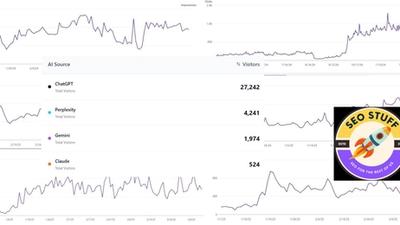
Free SEO + AI Search Audit. Charts visualize your business data clearly. But how clearly is your business visible across Google AND AI search platforms like ChatGPT, Claude, Perplexity, and Gemini? Run your free audit → to see exactly where your site stands across every major platform in 60 seconds.
What Charts Can You Make in Google Sheets?
In simple terms, Google Sheets supports about 30 different chart types covering essentially every common visualization need:
- Column and bar charts — for comparing values across categories
- Line and area charts — for trends over time
- Pie and doughnut charts — for share-of-whole compositions
- Scatter and bubble charts — for relationships between two or three variables
- Histograms — for distributions
- Combo charts — for mixing column and line on the same axis
- Waterfall charts — for sequential changes (added in 2018)
- Map charts (geo) — for geographic data
- Treemap, candlestick, organizational, gauge, scorecard, and timeline charts — for specialized use cases
Google Sheets isn't as visually capable as Tableau or Looker Studio for advanced visualizations, but for the 90% of charts most people actually need, it does the job in seconds.
How to Make a Chart in Google Sheets (Step-by-Step)
Building a chart takes about 30 seconds once your data is organized.
- Organize your data. Most charts need at least two columns: labels (categories or dates) and values (numbers). For multi-series charts, add additional columns. Use clean headers in the top row.
- Select your data range. Highlight the cells you want to include, including header row.
- Go to Insert → Chart in the menu bar.
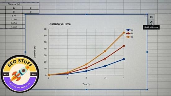
- Google Sheets automatically inserts a chart and opens the Chart editor panel on the right side of the screen. By default it picks a chart type it thinks fits your data — often a column chart for categorical data, a line chart for time series.
- In the Chart editor's Setup tab, change the Chart type dropdown to your preferred type (pie, line, area, scatter, etc.). The preview updates immediately.
- Verify the data range, X-axis (Label column), and Series (Value columns) are correct. The Chart editor lets you adjust these if Google Sheets guessed wrong.
- Switch to the Customize tab to format the chart. Adjust colors, fonts, gridlines, legend position, axis labels, chart title, and any chart-type-specific options.
- Click outside the chart to deselect. The chart is now embedded in your sheet.
To move or resize the chart, click it once to select, then drag the corners. To return to the editor, double-click the chart.
Useful Customizations You Should Know
A default Google Sheets chart looks fine. A few tweaks make it presentation-ready.
Chart Title and Axis Titles
In Customize → Chart & axis titles, edit the chart title to be specific ("Q3 Revenue by Region" beats "Revenue"). Add x-axis and y-axis titles so viewers know what each axis represents. Adjust font size, weight, and color.
Colors
In Customize → Series, change each data series' color individually. Use your brand colors for client deliverables, or use semantic colors (red for negative, green for positive, yellow for warning) for performance metrics.
Legend Position
In Customize → Legend, change the legend position (Top, Right, Left, Bottom, None). Smaller charts benefit from a top or bottom legend; larger ones look balanced with a side legend. For single-series charts, often you can hide the legend entirely and rely on the chart title.
Gridlines and Tick Marks
In Customize → Gridlines and ticks, reduce gridline density for a cleaner look. Default Google Sheets charts have a lot of gridlines; halving them often improves readability.
Data Labels
Under each chart type's settings, enable Data Labels to show numeric values directly on bars, segments, or points. Useful when precision matters more than visual flow.
Axis Formatting
For y-axis with currency or percentage values, customize the format in Customize → Vertical axis → Number format. Excel-style format strings work ($#,##0 for currency, 0% for percentages, etc.).
Free SEO + AI Search Audit. Charts in Google Sheets help you see what's happening in your data. The same clarity is available for your search performance — but only if you check. Run a free audit of how your site performs in Google AND in ChatGPT, Claude, Perplexity, and Gemini — and where the biggest gaps are.
Smooth Lines (Line Charts)
For line charts, enable Customize → Series → Line smoothness to add a slight curve to your lines. Makes time-series data look less jagged and more polished.
Trend Lines
For scatter and line charts, add a Customize → Series → Trendline to show the overall direction of the data. Choose linear, exponential, polynomial, or logarithmic fit.
How to Choose the Right Chart Type
The most common mistake in Google Sheets charting isn't formatting — it's picking the wrong chart type. Here's the quick guide:
Use a Column Chart When...
You're comparing discrete categories (regions, products, departments). Column charts (vertical bars) work best with 5-10 categories.
Use a Bar Chart When...
You have many categories OR long category names. Horizontal bars handle 10+ categories more readably and accommodate long labels (department names, product names, full sentences).
Use a Line Chart When...
You're showing change over time (months, quarters, years). For multiple series, lines outperform stacked columns because they share a common baseline.
Use a Pie Chart When...
You're showing how a whole breaks into parts AND you have 2-7 categories. More than 7 segments, switch to a bar chart.
Use a Scatter Chart When...
You're showing the relationship between two variables (price vs. units sold, advertising spend vs. revenue). Add a trendline to make the relationship explicit.
Use a Combo Chart When...
You have two metrics on very different scales (revenue and conversion rate). Plot one as columns, the other as a line, each on its own y-axis.
Use a Geo/Map Chart When...
Your data has location info (countries, states, cities, lat/long). Maps are immediately readable for spatial data.
When Should You Use Google Sheets for Charts?
Google Sheets is the right charting tool in these scenarios:
1. Quick Charts for Documents and Presentations
If you have data in a Sheet and need a chart for a Google Doc or Slide, Google Sheets is the obvious choice. The chart embeds cleanly with auto-update when source data changes.
2. Collaborative Reports
When multiple people need to view (or edit) the same data and chart, Google Sheets' real-time collaboration beats Excel.
3. Embedded Charts on Websites
Sheets charts can be embedded via iframe. Useful for blog posts, marketing pages, and internal wikis.
4. Mobile-Friendly Reports
Google Sheets charts render well on mobile, which matters for executive dashboards that get read on phones.
5. Small to Mid-Size Datasets
For data under ~10,000 rows, Google Sheets handles charting efficiently. Larger datasets, move to Looker Studio or BigQuery.
Free SEO + AI Search Audit. Whatever you're charting, the underlying question is what's actually happening with your business. Most teams know their Sheets data — but they don't know how their *website* is performing across Google and AI search. Get a free audit of where your site stands across every major search and AI platform.
Limitations of Google Sheets Charts
Limited visual sophistication. For polished executive dashboards or marketing-grade infographics, Tableau and Looker Studio offer more customization.
Mobile editing is awkward. Building or customizing charts on a phone is painful. Edit on desktop.
Embedded charts can be slow to refresh. If you embed a Sheets chart on a website, viewers may see a brief loading state while the chart fetches data.
Some chart types are basic. Specialized visualizations (Sankey, network diagrams, advanced statistical charts) aren't supported. Use a dedicated tool.
Performance on large datasets degrades. Charts on 50,000+ rows can slow down the sheet noticeably.
Custom formatting limits. Color palettes, fonts, and detailed styling are more limited than in dedicated BI tools. For brand-consistent dashboards, Looker Studio gives you more control.
Limited interactivity. Sheets charts can't filter dynamically based on user clicks. For interactive dashboards, use Looker Studio (free) or Tableau.
Final Thoughts
A chart in Google Sheets is the fastest way to turn data into a visual story for everyday business communication. For 90% of charts you need to create — reports, presentations, internal dashboards, quick analyses — Google Sheets is the right tool, and the 30-second build time is unbeatable. For more polished, interactive, or large-data work, graduate to Looker Studio or Tableau.
But making good charts is only half of communicating well. The other half is making sure people can find your business in the first place. In 2026, that increasingly means being visible not just in Google but in ChatGPT, Claude, Perplexity, and Gemini when buyers ask AI for product recommendations. Most teams have no idea where they stand in those AI answers. Run a free audit to see exactly where your site performs across Google AND every major AI search platform — and which fixes will move your traffic the fastest this quarter.